UX, UI

Parachute Navigation

. A new menu navigation for high-end luxury home goods

YEAR:  
2023,2024
COMPANY:  
Parachute
ROLE:
UX,UI

Project Overview

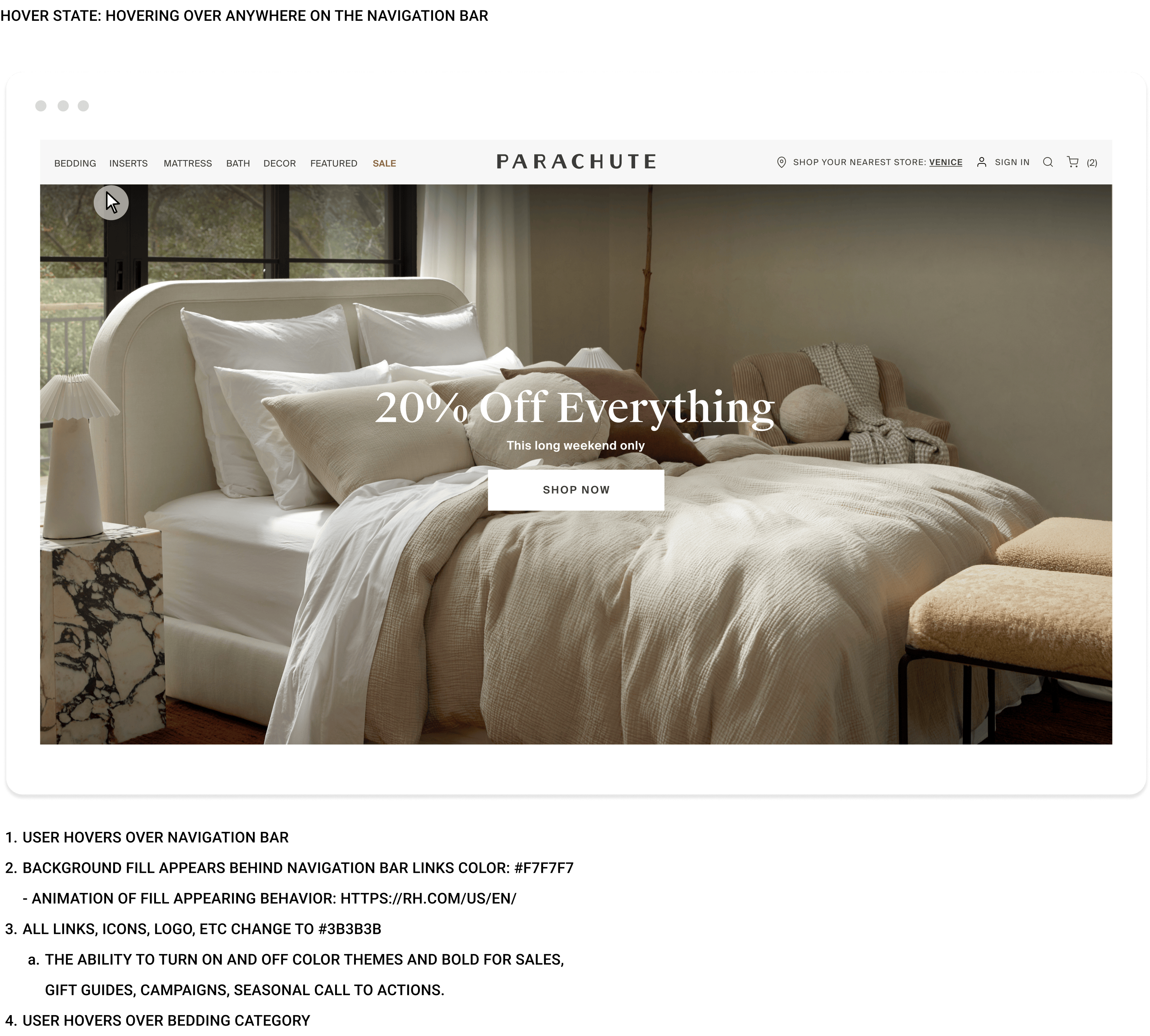
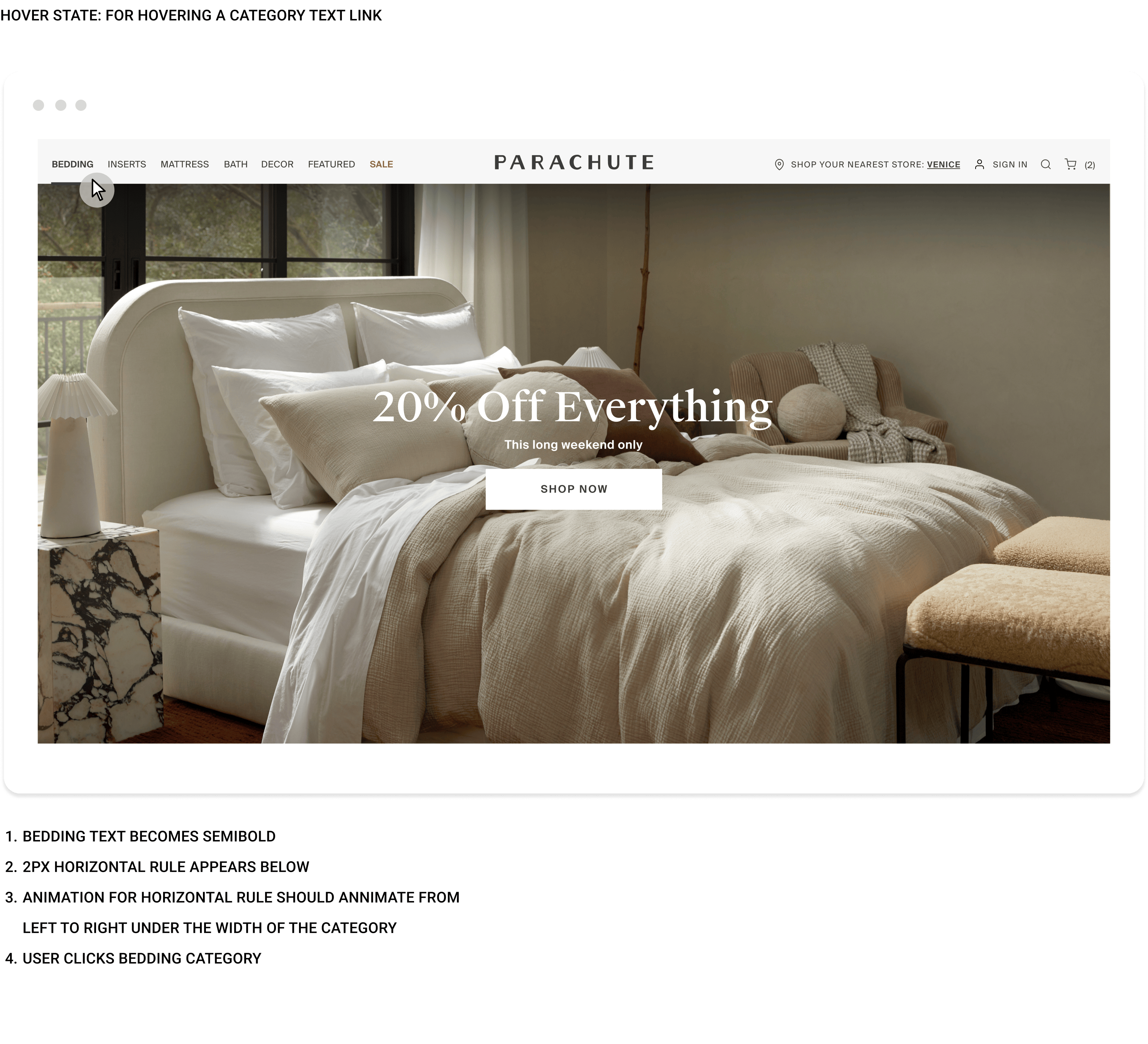
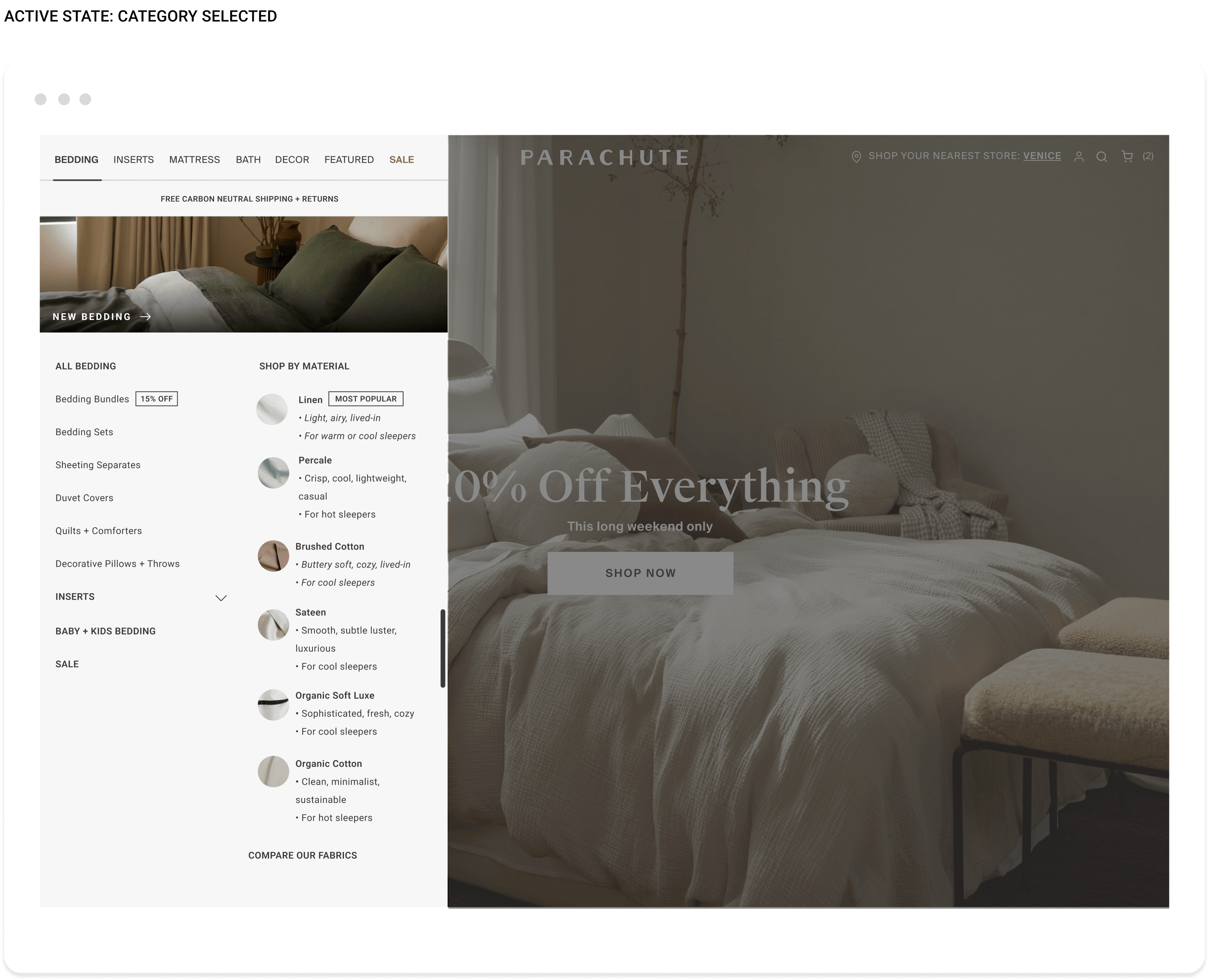
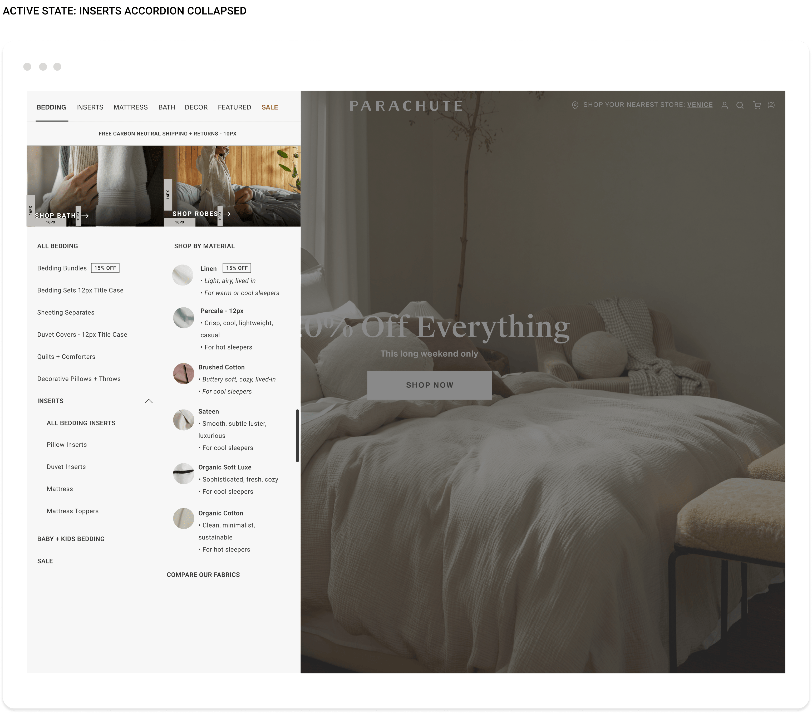
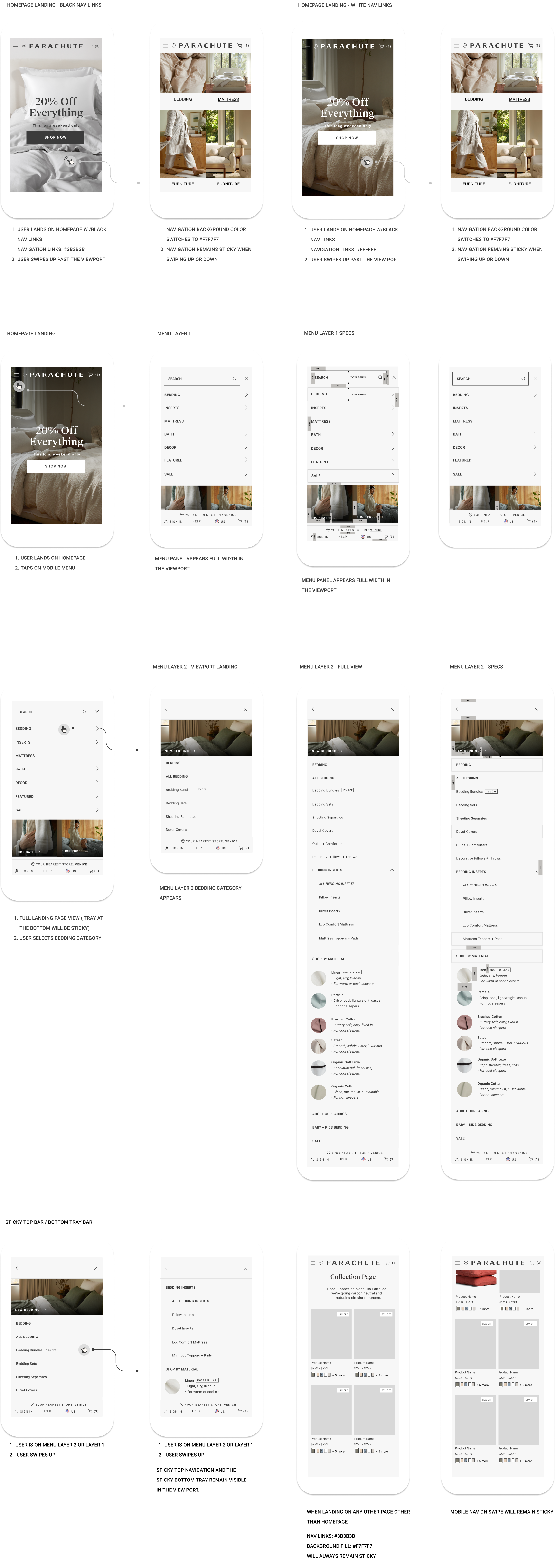
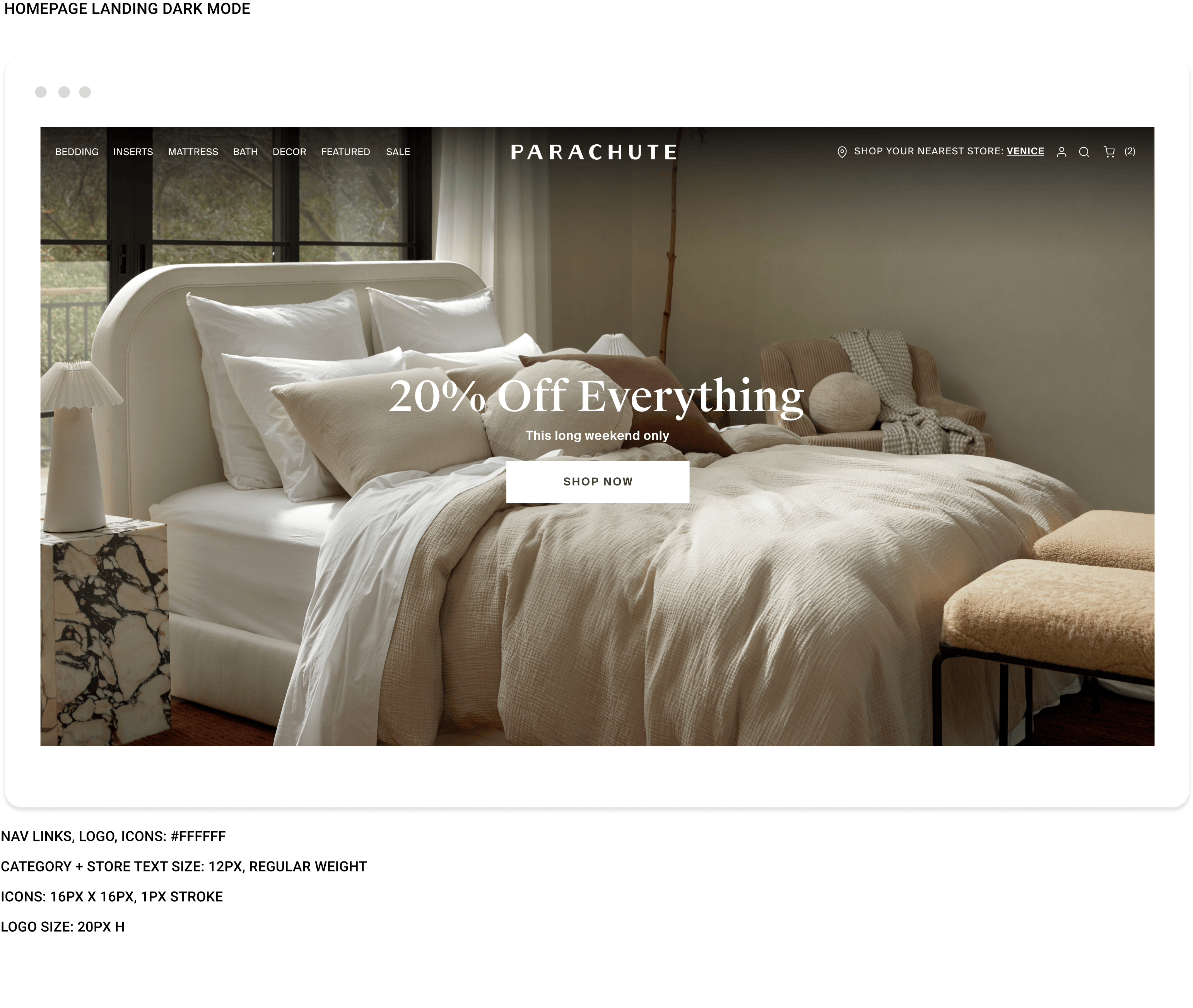
Collaborated with merchandising, product and development teams to develop a new navigation experience that aligns with user research studies, data insights, and the new Parachute rebrand initiatives.

Problems

- Not mobile friendly
- Confusing taxonomy
- Customers found it difficult to navigate or find products
- Hidden search
- Hidden store location
- Inconsistent design across categories
- Overload of categories and confusing category placement
- Vague merchandising and information architecture
- Onerous features and functionality
- Lack of flexibility
- Lack of content and merchandising opportunities
- Heavy dependency upon development teams

Solution

- Mobile-first, consistent and accessible design
- Increased findability of categories, store, search, etc.
- Information architecture aligned with ux best practices
- Increase taxonomy comprehension
- End-to-end, data-driven personalization
- Baked in conversion improvements
- Simplified business manager tools
- Increase in bundles and sets

Results

This redesign demonstrates the power of research-driven design decisions, enhancing both user satisfaction and business performance.

Average Order Value

Increased by +13.6%
Revenue Per User
Improved by +16.8%
Bundle Sales
Rose by +31.25% as a result of clearer bundling options and navigation cues
Swatch Purchases
Jumped by +286%, attributed to better product discoverability
Mobile Add-to-Cart Rate
Improved by 15-20%, with a conversion rate boost of 12-18% due to the streamlined mobile experience

Process

The entire scope of the process for the project

Figma
Miro
Contentful

1 UX, UI Designer
1 Product Manager
1 Merchandiser
1 Engineer

UX, UI,
Product Design
Research
Project Management

Discovery: 2 weeks
Define: 2 weeks
Design: 2 weeks
Development: 2 weeks

Discover
Define
Design
Implement

Testing
Iterations
Considerations

Research

The redesign was directly informed by extensive research gathered in Q4 2022 and Q1 2023. Conducted various research studies by going into Venice, Chicago and Nashville stores. Interviewed both customers and associates by taking screen-recordings on mobile and desktop and extracted customers feedback.

Key issues included:

  • Customer Shopping Behavior: Research revealed that customers shop by type, fabrication, and styling preferences, validating the need for simplified, intuitive navigation​.
  • Feedback on Bundling and Personalization: Customers desired easier mix-and-match options and were overwhelmed by non-curated bundles. We implemented clearer product grouping and custom recommendations to address this​.
  • Mobile Usability Tests: Participants struggled with mobile navigation and filtering. Enhancements in mobile optimization and responsive design directly addressed these pain points

Before

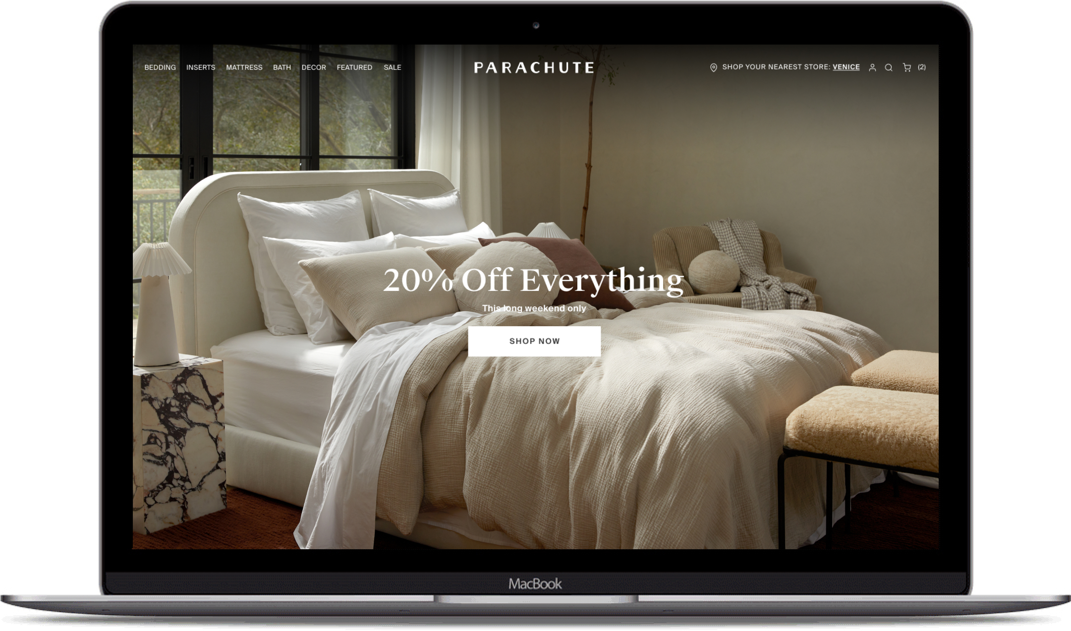
The original navigation for our e-commerce platform lacked alignment with our product offerings and user expectations. With a relatively small product catalog, the structure overcomplicated the user journey.

Key issues included:

  • Overcategorization:
    The navigation included excessive subcategories, leading users to unnecessary clicks to find products.
  • Unpredictable Sorting:
    Products were displayed without logical grouping (e.g., by material, category, or style), leaving customers unsure of where to start their journey.
  • Lack of Personalization:
    The navigation failed to reflect customer preferences or shopping behaviors, such as browsing by style, color, or fabrication.
  • Mobile Frustrations:
    Mobile users faced additional challenges navigating due to poor optimization, excessive scrolling, and missing search functionality.These design flaws contradicted user expectations, as highlighted in our usability research. Participants consistently expressed frustration with the disorganized layout, unpredictable sorting, and the time-consuming process of finding specific products.

Before Examples

After

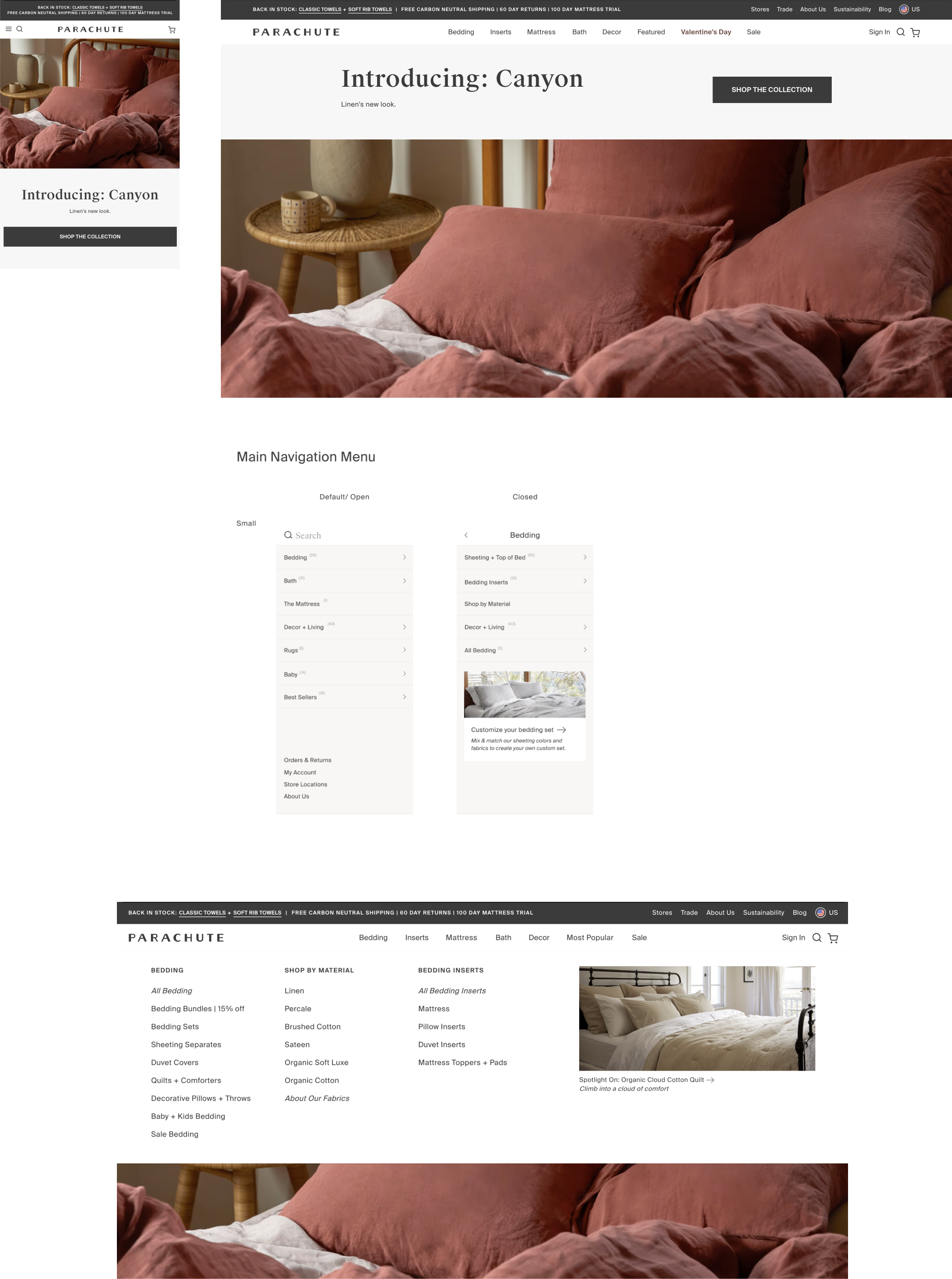
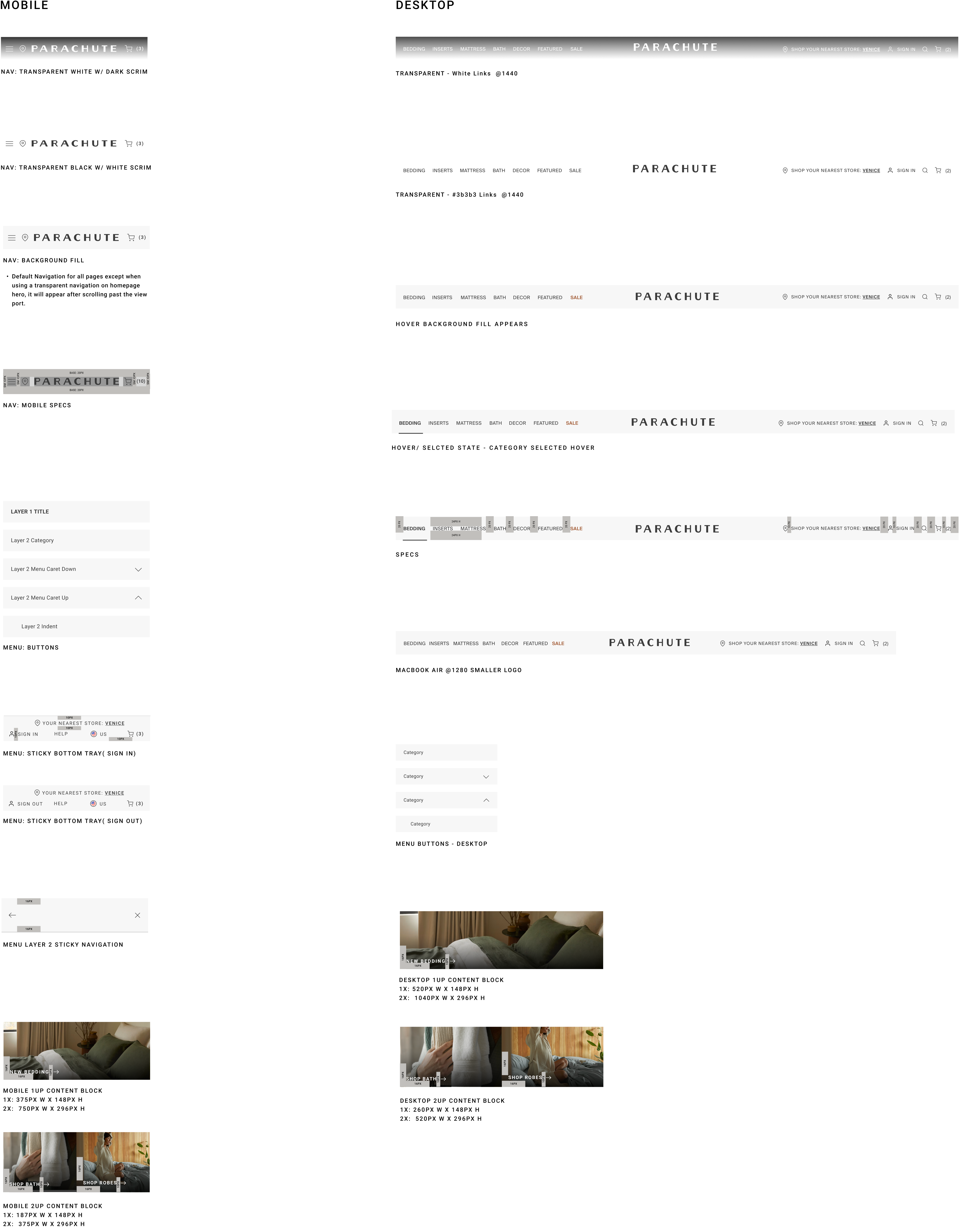
The new navigation, launched and was built to address the pain points documented, leveraging insights from user research and industry best practices.

Key improvements included:

  • Simplified Categorization:
    The navigation was condensed into broader categories, such as "Build Your Bed," "Fabrication," and "Inspiration," which align with how customers naturally shop. This reduced cognitive load and streamlined decision-making.
  • Logical Product Grouping:
    Products were sorted predictably, ensuring that users could easily locate items by fabric, category, or styling preferences. Predictability was a top priority based on customer feedback.
  • Enhanced Mobile Experience:
    The navigation was optimized for mobile with clearer touch targets, reduced steps to find key products, and improved filtering options.
  • Personalization Features: Recommendations based on browsing history and shopping behaviors were introduced, helping users find complementary products faster.
  • Visual Clarity:
    The hierarchy of navigation elements was improved using visual cues, such as spacing and font sizes, to guide the user effortlessly.

Style Guide

Mobile

Desktop

SEE IT LIVE

Let's Chat!

CONTACT ME