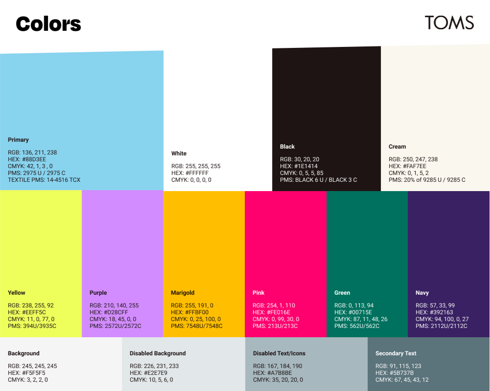
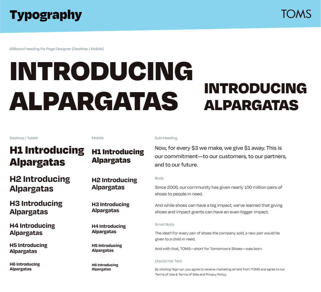
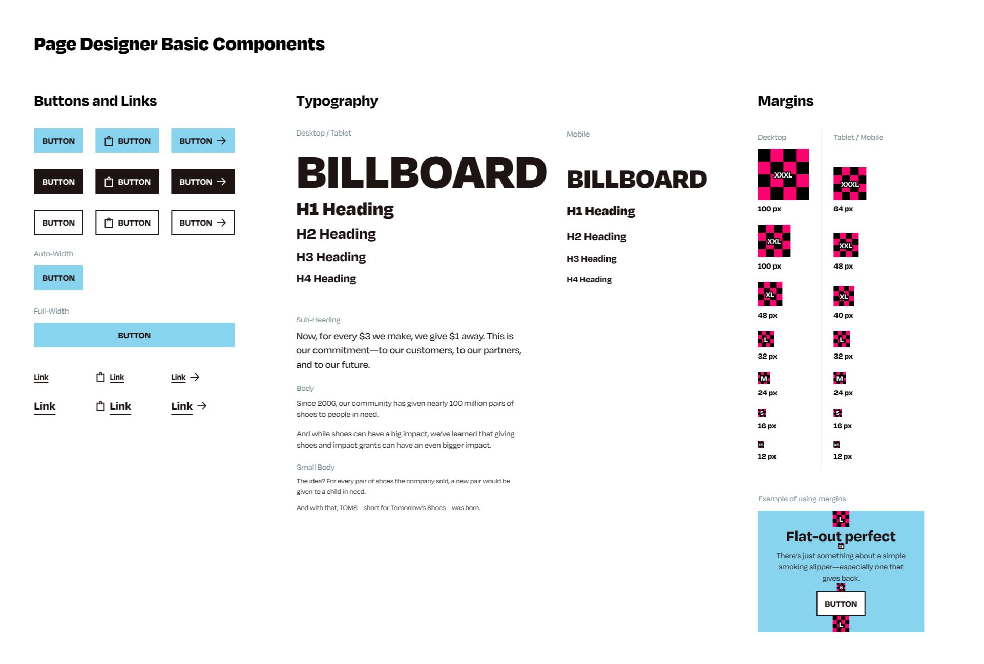
A new rebrand for TOMS with an updated design system
Collaborated with creative, merchandising, product and development teams to develop a new TOMS rebranding with an updated design system.
- Not mobile friendly
- Confusing taxonomy
- Customers found it difficult to navigate or find products
- Hidden search
- Hidden store location
- Inconsistent design across categories
- Overload of categories and confusing category placement
- Vague merchandising and information architecture
- Onerous features and functionality
- Lack of flexibility
- Lack of content and merchandising opportunities
- Heavy dependency upon development teams
- Mobile-first, consistent and accessible design
- Increased findability of categories, store, search, etc.
- Information architecture aligned with ux best practices
- Increase taxonomy comprehension
- End-to-end, data-driven personalization
- Baked in conversion improvements
- Simplified business manager tools
- Inject at opportune times to offer product knowledge when it is relevant to the customer’s journey.


